Flexible box

Flexible box or commonly known as flexbox is a popular CSS property used to align and layout elements on the screen easily and with more control.
Flexbox mainly consists of two parts, the container and the items inside it. Both the container and the items have separate properties.
We will start with this code
//HTML
<div class="container">
      <div class="box box-1">Box 1</div>
      <div class="box box-2">Box 2</div>
      <div class="box box-3">Box 3</div>
      <div class="box box-4">Box 4</div>
</div>
//CSS

body {
  margin: 0;
  padding: 0;
}

.box {
  width: 80px;
  background-color: #05386b;
  padding: 3rem;
  color: white;
  font-size: 2rem;
}

.container {
  background-color: #5cdb95;
  padding: 8rem 8rem 8rem 2rem;
}
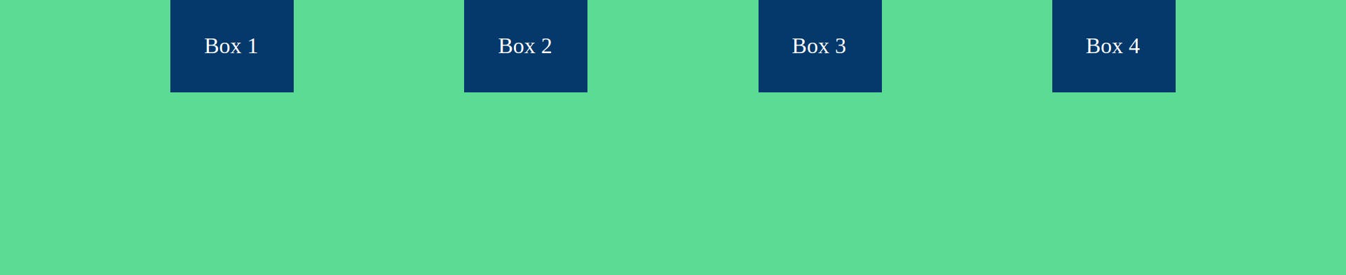
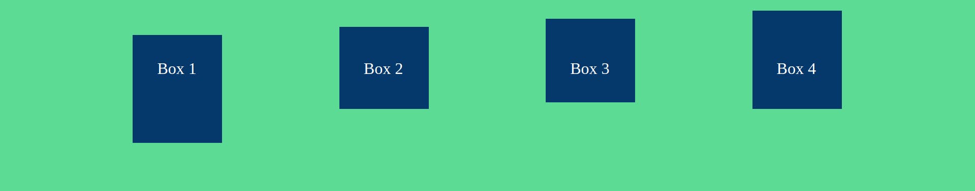
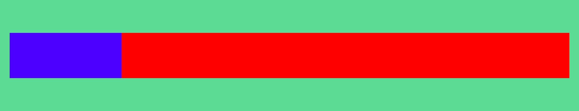
With the initial code the boxes will be placed like this:

To apply flex properties we start with display: flex on the container. The other properties of the container are:
- flex-direction
- justify-content
- align-items
- flex-wrap
1) flex-direction
This is used to apply a direction to the items. flex-direction has four values as below.
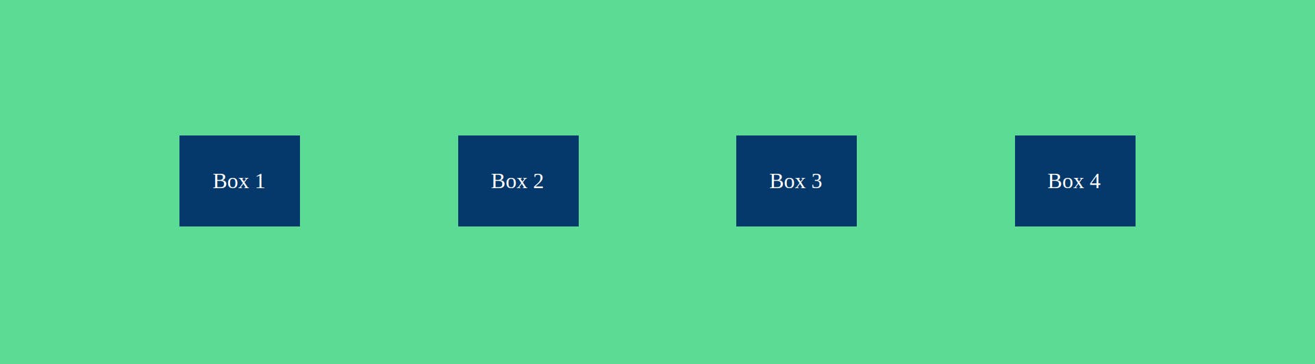
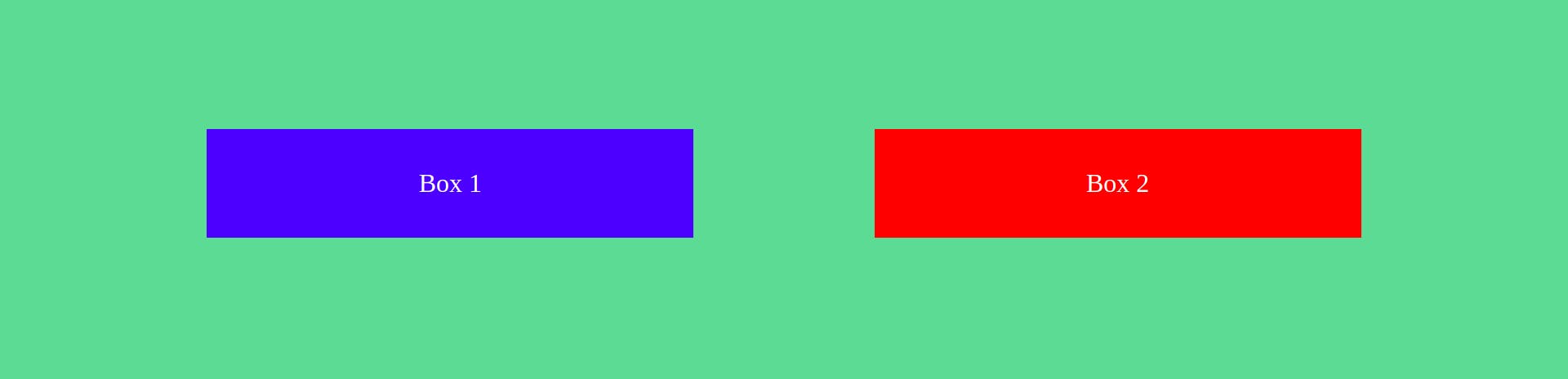
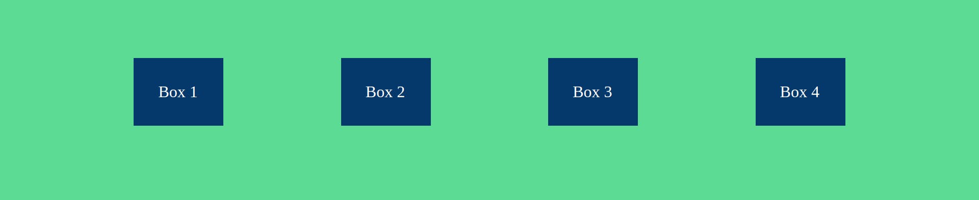
i. row
This will arrange the boxes in a horizontal line. Here the flex starts from left and ends at right. This is also the default value for flex-direction.
.container {
  background-color: #5cdb95;
  padding: 8rem 8rem 8rem 2rem;
  display: flex;
  flex-direction: row;
}
Boxes are now arranged like this

ii. row-reverse
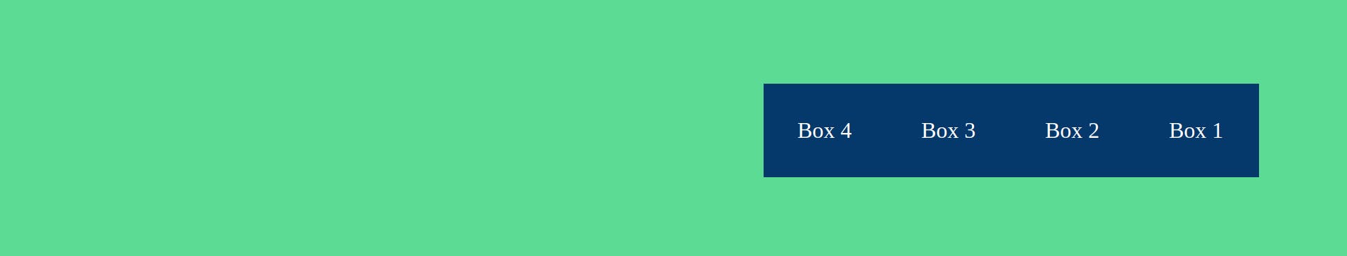
This too will arrange the boxes in horizontal order but the order will be reversed and the boxes will be pushed to the right. i.e flex starts from the right and ends at left. We can imagine it as writing Urdu.
iii. column
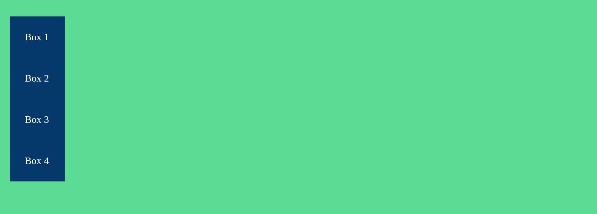
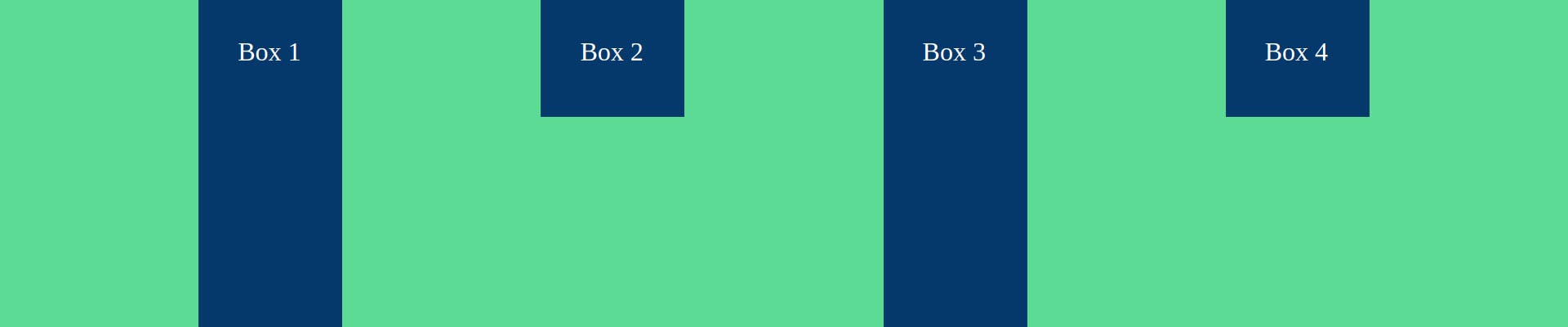
This arranges the boxes vertically in top to bottom order. Here the flex starts from top and ends at bottom.
iv. column-reverse
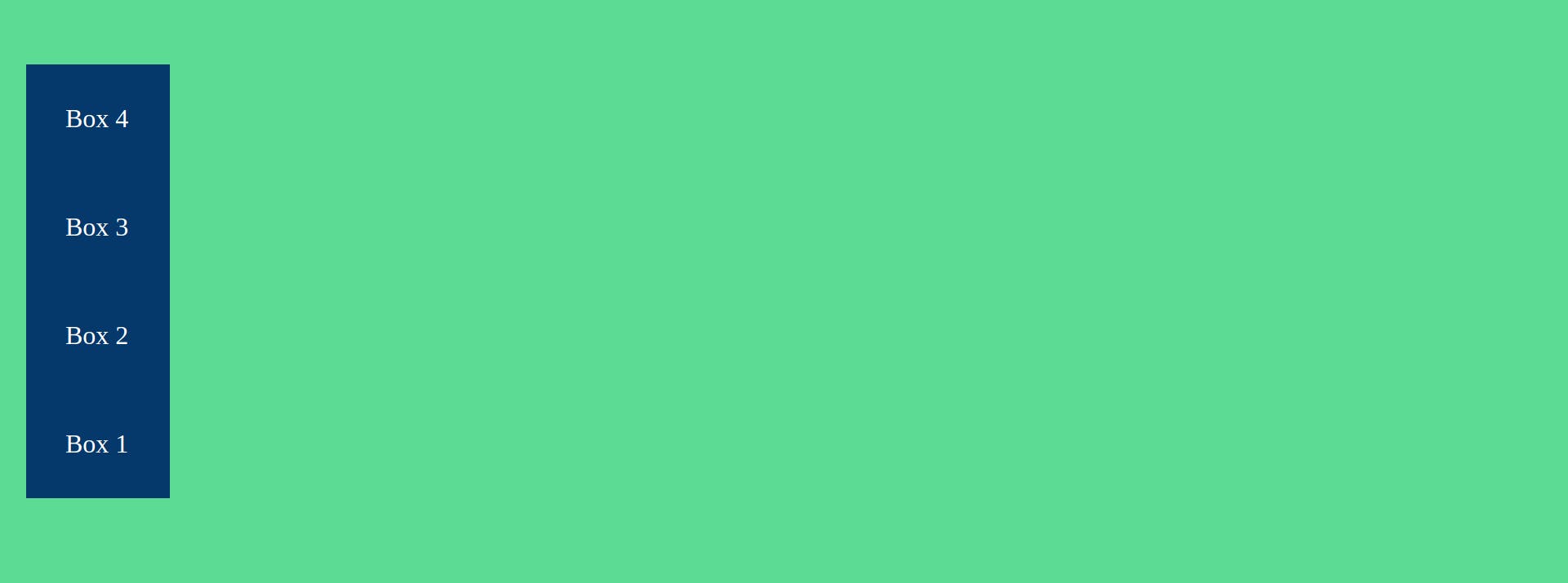
Arranges boxes vertically in the reverse order starting from the bottom. Here flex starts from bottom and ends at top.
One important and easy thing to understand in flexbox is the concept of the axis.
Main axis
This is the line that runs through all the items in the container. In case of flex-direction: row main axis is a horizontal line and in the case of flex-direction: column its a vertical line.
Cross axis
This axis is at 90 deg to the main axis.
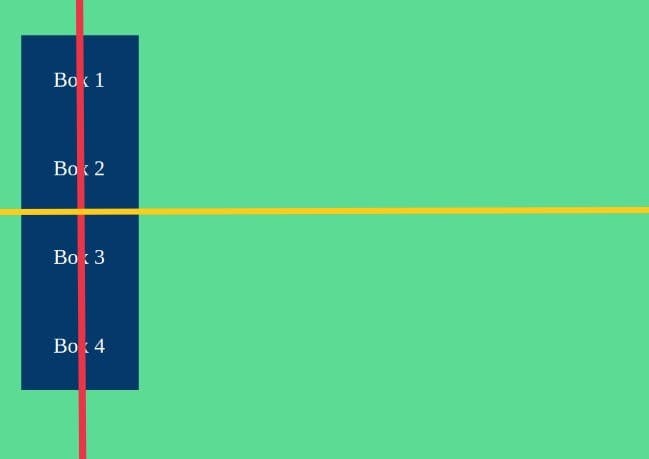
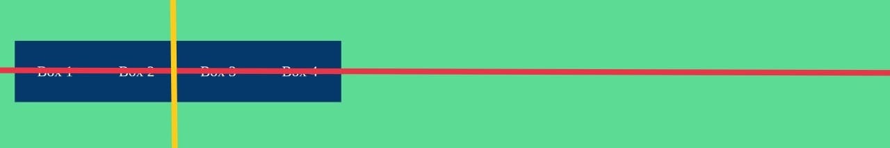
The below illustrations help understand the axis positions in case of both row and column directions.
The red line represents the main axis and the yellow line represents the cross axis.
flex-direction: row
flex-direction: column
2) justify-content
This property is used to align the properties along the main axis. It can take the following values.
i. flex-start
It is the default value for justify-content, its stacks all the items to the start of flex. i.e. to the left for row, right for row-reverse, top for column, and bottom for column-reverse.
ii. flex-end
Here all the items of the container are stacked to the end of flex. i.e. to right for row, left for row-reverse, bottom for column, top for column-reverse.
iii. centre
As the name suggests the items are stacked together in the center of the container.

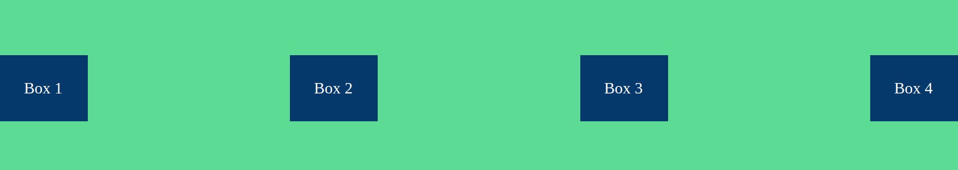
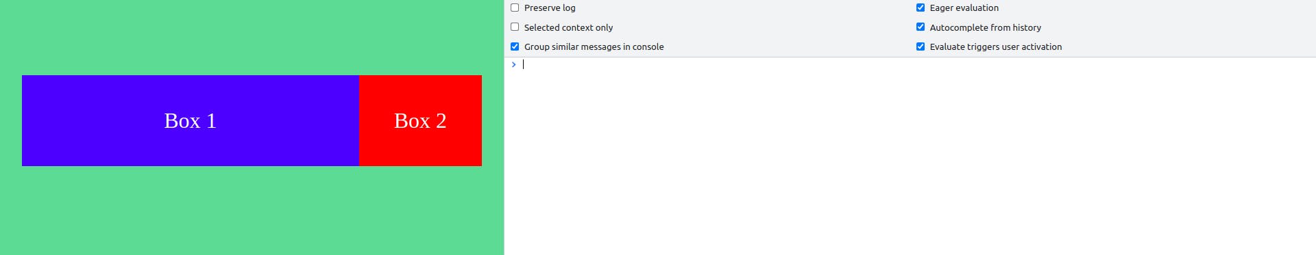
iv. space-between
The first and the last boxes are fixed to their respective edges and the remaining space is distributed among the remaining boxes evenly.
Note: Removed side padding from container to illustrate properly.
.container {
  background-color: #5cdb95;
  padding: 8rem 0;
  display: flex;
  justify-content: space-between;
}
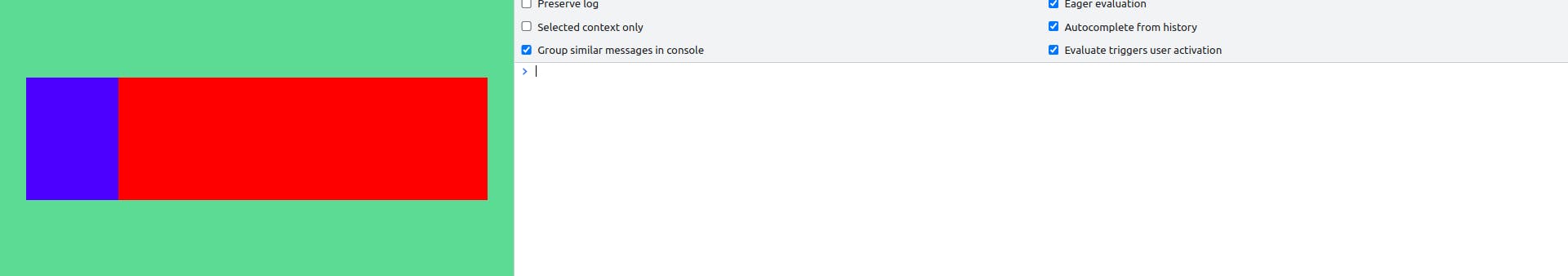
v. space-around
Here the difference is that the first and last items are not stacked to the edges but have half the space of space between the other items.
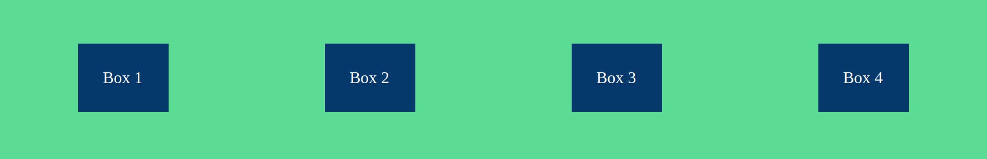
We can visually notice that the space between the left edge and box 1 as well as the right edge and box 4 is half the space between box 1 and box 2, or any other in between boxes.
vi. space-evenly
Here the whole space is divided evenly. That means space between the first box and the left edge and the last box and right edge is equal to the space between other boxes.

3) align-items
This property is used to align items along the cross axis. We will take the example of flex-direction: row, the same can be used to understand this property's effects on other flex directions.
Few values are the same as justify-content, align-items can take the following values.
i. flex-start
This is similar to flex-start of justify-content and aligns the items to the start of the flex but on the cross axis, which is the vertical axis in this case.
ii. centre
This aligns the items to the center of the cross axis.
iii. flex-end
This aligns the items to the end of the cross axis.
iv. stretch
This property stretches the items from end to end only if the size of the items is not mentioned.
.box {
  width: 80px;
  background-color: #05386b;
  padding: 3rem;
  color: white;
  font-size: 2rem;
}

.box-2,
.box-4 {
  height: 100px;
}
Here we have fixed the height of two boxes and the other two are uninitialized, lets see the output.
 Since box-2 and box-4 have initialised height they maintain their height whereas box-1 and box-4 stretch from end to end according to the stretch property.
v. baseline
Here the items are aligned according to the base of text contained in them.
We can see that irrespective of the size of the items they get aligned according to the base of the text
4) flex-wrap
By default, the items in a row remain in the same row together. This behavior can be changed with flex-wrap. It has three properties.
i. nowrap
This is the default property and behaves as mentioned above.
ii. wrap
This allows items to break off and form a new row or column in the top to bottom or left to right order respectively upon resizing of the screen.
iii. wrap-reverse
This allows items to break off and form a new row or column in the bottom to top or right to left order respectively upon resizing of the screen.
Well done for reading till here, you will get rewarded for this. And the reward is the answer to the most dreaded question: How to center a div?
.container {
  display: flex;
  justify-content: space-evenly;
  align-items: flex-end;
}
Yes, just these three lines will perfectly center your div!
Now we move on to the flex properties for the items inside the flex container, The properties are:
- flex-shrink
- flex-grow
- flex-basis
- flex
- order
- align-self
1) flex-shrink
This property determines how much the items should shrink when the container width becomes less than the total width of all the items inside it. It takes numbers as values. The greater the number, the more it will shrink compared to other items. These values are relative to each other. For example, if box-1 has flex-shrink:1 and box-2 has flex-shrink: 2, then box-2 will shrink twice as much as box-1.
For easy visualization, we set flex-shrink values for box-1 and box-2 as 1 and 4 respectively. Initially, when the container width is more than the sum of the width of both boxes it will look like this:
Now when we resize our window such that window width becomes considerably less than the sum of both boxes, they will start shrinking according to the flex-shrink property.
We can easily notice that box 2 has shrunk more.
2) flex-grow
flex-grow determines how much the items will grow or expand when the container width increases. Similar to flex-shrink the values here too are relative. It will always expand item width to fully fill the container width. For example, see this initial state.
We have not specified any width for the items but they grow in accordance with flex-grow property to fill the container width.
 Here when we expand the window size then items still grow and cover the full width of the container.
3) flex-basis
This property is used to set the initial size of the items before the flex-grow and flex-shrink properties act upon the items. This property takes values in units of px, rem, em, etc.
4) flex
This is not a new property but just a shorthand for flex-grow, flex-shrink, and flex-basis
.box-1 {
    flex:2,4,3rem
}
The above code snippet sets: flex-grow:2, flex-shrink:4 and flex-basis:3rem
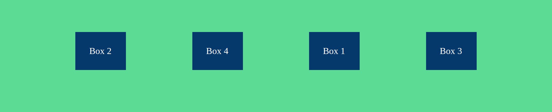
5) order
By default, the items in the container are ordered the way they are in the HTML file. We can use order property to change the order of the items. The greater the value the more it will be shifted towards the flex-end and vice-versa.
Initially, it looks like:
Now if we set the following order,
.box-1 {
  order: 3;
}

.box-2 {
  order: 1;
}

.box-3 {
  order: 4;
}

.box-4 {
  order: 2;
}
it will look like this
6) align-self
align-self is used to align items on the cross axis individually, align-self property takes the same values as align-items and overrides any property set by align-items.
 Here initially we have set align-items to center and later set align-self property of box-1 to flex-start, therefore all boxes are at the center whereas box-1 is aligned on top(flex-start) overriding the align-items: center property.
That's it, folks, now you know all you need to start using flexbox in your projects.
BONUS: You can visit flexboxfroggy.com to practice and learn flexbox in an interactive way.